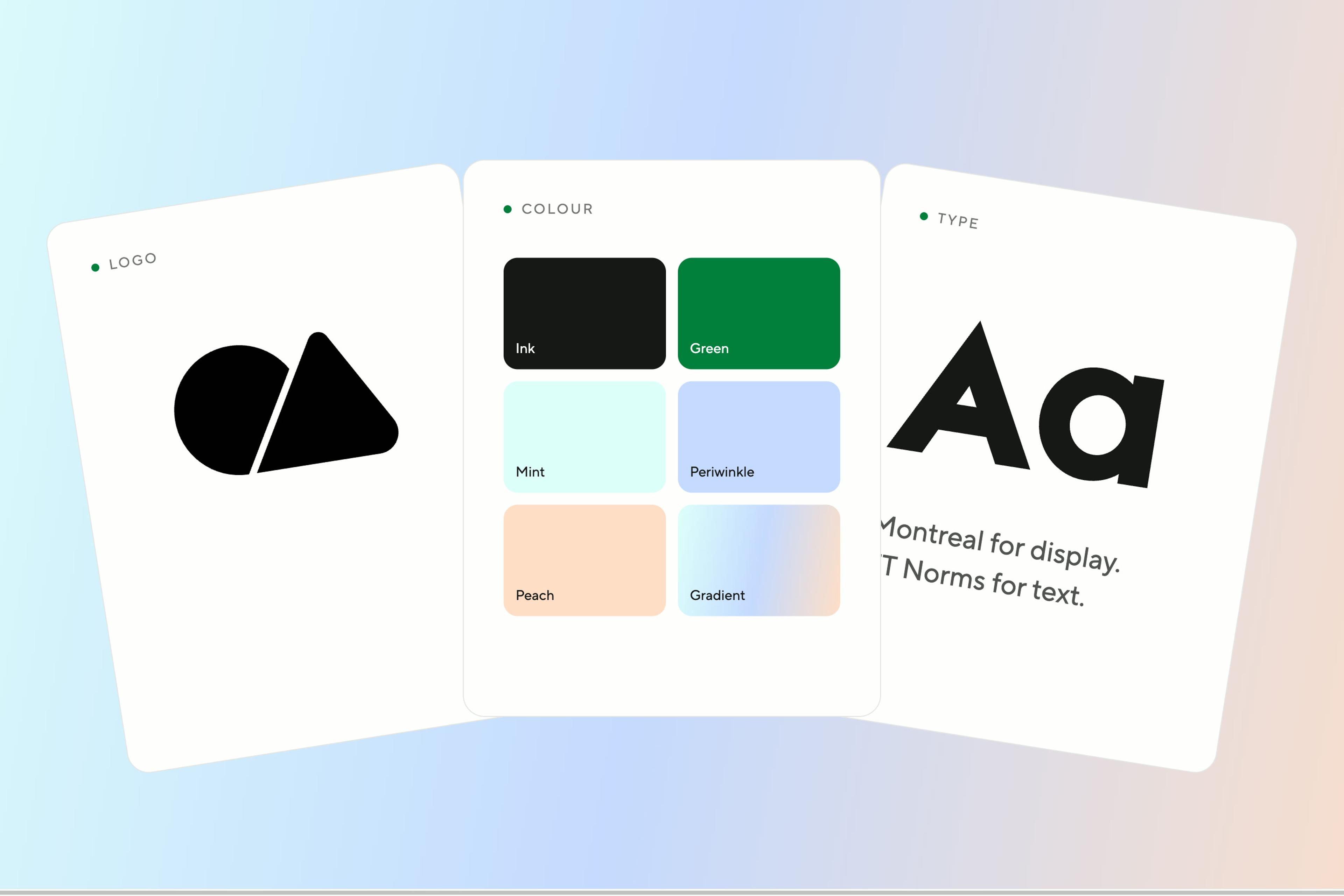
Your logo is usually the first piece of your brand people see, and often the one they see most. It's worth knowing what yours is saying.
Wordmark: when your name is the brand
A wordmark is your business name, set in carefully chosen or custom type.
- Signals: confidence in the name.
- Works for: short, distinctive names, consultancies, professional services and personal brands.
- Watch out for: long or generic names. The typography carries the whole identity, so a default font won't do.
Lettermark: making initials work
A lettermark reduces the name to its initials.
- Signals: efficiency and structure.
- Works for: long or multi-word names, and established firms in corporate, legal or technical fields.
- Watch out for: new businesses. Initials mean nothing until people know the name behind them.
Pictorial mark: a single recognisable image
A pictorial mark is a literal symbol, such as a house, a leaf or a key.
- Signals: instant recognition without words.
- Works for: brands with a clear, ownable visual idea.
- Watch out for: clichés. A roof for a builder or scales for a law firm won't set you apart.
Abstract mark: feeling over description
An abstract mark is a shape that suggests an idea rather than showing one.
- Signals: innovation, movement and a brand with room to grow.
- Works for: businesses that expect to expand beyond one product or service.
- Watch out for: randomness. If you can't explain the idea in one sentence, it won't hold meaning.
Mascot: a character that carries the brand
A mascot is an illustrated character.
- Signals: friendliness and approachability.
- Works for: family, food, hospitality and community brands.
- Watch out for: scale and tone. Detailed characters get lost at small sizes and can undercut a premium price.
Combination mark: symbol and name together
A combination mark pairs a symbol with a wordmark that can also be used apart.
- Signals: clarity and flexibility.
- Works for: most small and mid-sized businesses. It's the most practical starting point.
- Watch out for: crowding. The symbol and the name should support each other, not compete.
Emblem: traditional and instantly credible
An emblem places the name inside a shape, such as a badge, seal or crest.
- Signals: heritage, authority and trust.
- Works for: hospitality, education, trades and trust-led industries.
- Watch out for: legibility. Detail disappears on phones and small screens, so emblems usually need a simplified version.
How to choose
| Your situation | Start with |
|---|---|
| New business, short and distinctive name | Wordmark or combination mark |
| Long or descriptive name | Lettermark, or a combination mark with a short form |
| Personal brand or partner-led firm | Wordmark |
| Growing and likely to diversify | Abstract or combination mark |
| Heritage or tradition-led sector | Emblem, with a simplified mark for digital |
| Established and simplifying | Pictorial mark or lettermark |
Every logo needs a system around it
A logo type is a starting point. What makes it work is the system around it: a primary version, a stacked version, a symbol-only version, clear-space rules, and colour and mono versions.
Do: Give it clear space
Do: Reverse on dark
Don't: Don't stretch it
Don't: Don't lose contrast
How much does a logo cost in Australia?
Our Essentials package, which covers a logo, core marks, colour and type, runs from $1,500 to $3,000 + GST and takes 2–3 weeks. See how much branding costs for the full breakdown.
Can I change my logo type later?
Yes. Many brands start with a combination mark and drop the name once the symbol is known. Plan the symbol so it can stand on its own.
Do I need a symbol at all?
No. A well-drawn wordmark is often stronger than a weak symbol. A symbol is useful for avatars, favicons and signage.
Key takeaways
- Your logo type signals something before people read the name.
- Wordmarks and combination marks suit most growing businesses.
- Always test at 32px, and plan a full set of versions.
Your logo isn't your brand. It's the symbol people learn to connect with your brand, and it earns its meaning through consistent delivery on what you promise.