Being Human Care
Shaping a brand identity that reflects care, trust and accessibility
- 2020
- Health & Social
- Brand Foundations
- Digital Platforms
The brief
What did Being Human Care need?
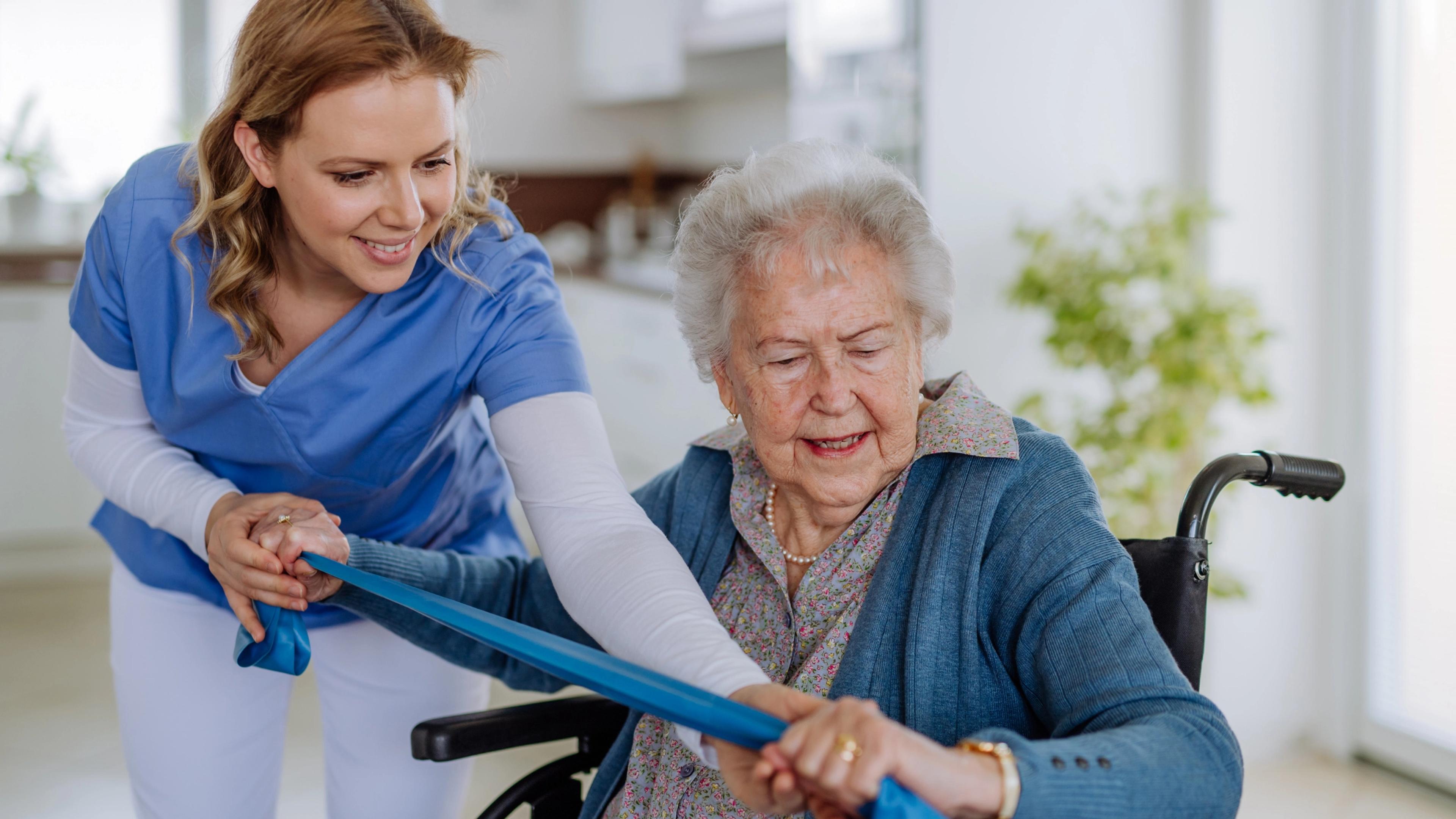
Being Human Care is a registered NDIS disability support and in-home care provider delivering personal care, nursing, domestic support, social participation and everyday living support for people with diverse needs. In a sector where people seek reassurance and understanding before reaching out, the brand and digital presence needed to reflect both care and confidence. We partnered with the team to develop a brand identity and website that present their services clearly, support accessibility, and help people connect with the support they need.
A website built to support accessibility, navigation and enquiry confidence
The website was designed to make information easy to find, read and move through at a steady pace. Page structure and navigation support key browsing journeys, while enquiry pathways are intentionally simple and predictable. Accessibility informed contrast, typography and interaction behaviour so the experience remains comfortable and usable for a wide range of users.
A visual identity designed to feel credible, approachable and easy to apply
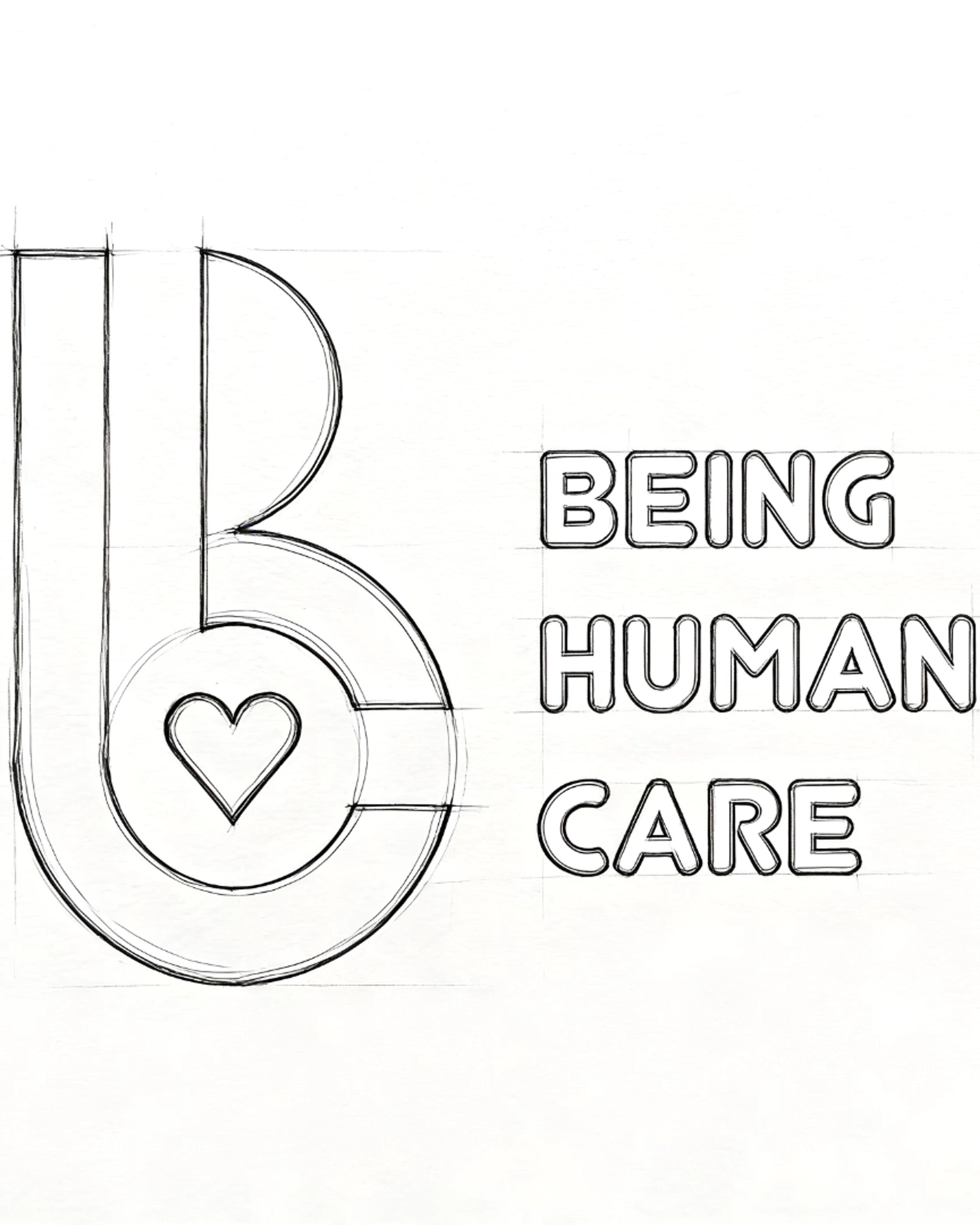
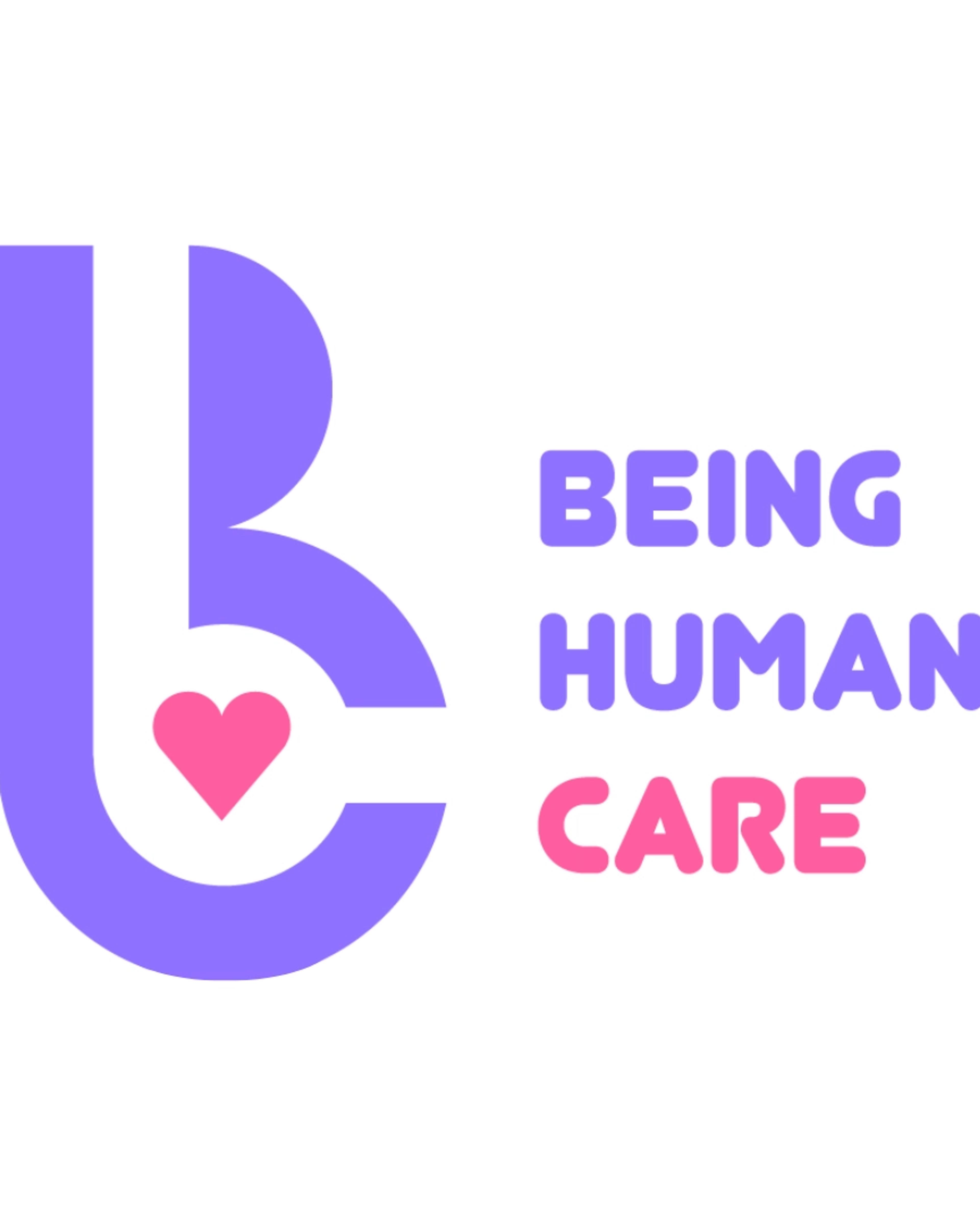
The brand identity was developed from early sketch concepts through to the final logo and visual system. The focus was on clarity, balance and everyday usability. Typography, layout and colour choices support recognition and structured presentation across digital and printed environments, giving the organisation a visual language that feels consistent, steady and professional.
Service communication shaped for understanding and decision making
Content was organised around how participants, families and carers look for support information. Services are presented in clear, practical language that explains what is offered, who it supports and how it fits into daily care situations. The tone remains direct and human, reducing unnecessary terminology and making it easier for users to interpret relevance and next steps.
Outcomes
What changed for Being Human Care?
A brand identity that feels human, genuine and trustworthy.
A visual system that carries warmth without losing professionalism.
A website designed for accessibility, comfort and everyday usability.
A digital presence that supports enquiry with confidence and care.
Impact
Results that matter
- engagement
- Increase in meaningful time spent across service and support pages.
- experience
- Improved accessibility, readability and comfort for users.
- conversion
- Growth in relevant enquiries with stronger user intent.
- satisfaction
- Higher trust and confidence among visitors and families.
- growth
- Improved brand presence across digital touchpoints.
- retention
- More returning visitors revisiting service information and enquiry pathways.

Next project · Radhe Wholesale and Retail